Dashboard examples

Dashboard examples you can click through yourself

Not brochure images but five working dashboards from Westra Bouw, a fictional construction company with 50 employees. See which KPIs, charts and drilldowns each department uses and open every example live in your browser.

Fictional data · refreshed every six hours · no account needed

Dashboard example: Westra Bouw leadership overview with revenue, result and margin

What belongs on a good dashboard?

A good dashboard shows five to ten key figures for one audience, each with a comparison: last year, budget or a target. Below them sit the charts that explain why a figure deviates, and one click shows the underlying invoices, hours or deals. The examples below follow that structure for leadership, finance, projects, hours and sales. The demo company is Dutch, so the dashboards use Dutch labels.

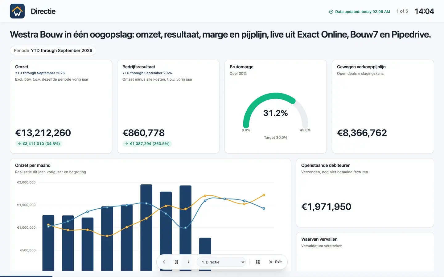
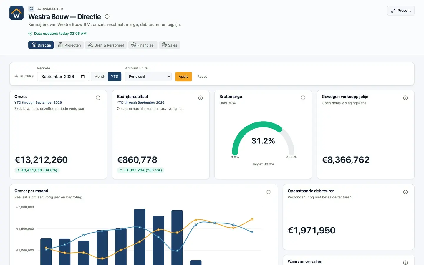
Leadership dashboard example with revenue, operating result, gross margin gauge and monthly revenue

Example 1 of 5

Leadership dashboard

One screen where the owner and management team see whether the year is on track: revenue, result, margin, receivables and the sales pipeline, each compared with last year or a target.

On this dashboard

  • Year-to-date revenue and operating result, with the change versus last year
  • Gross margin as a gauge against a 30% target
  • Monthly revenue next to last year and the budget
  • Waterfall from revenue to operating result
  • Open and overdue receivables
  • Revenue per project category and cumulative result

Why it works: Every tile answers one question and carries a comparison. A revenue figure on its own says little; ‘12% above last year and ahead of budget’ says a lot.

Sources: Accounting (Exact Online), project software (Exact Bouw) and CRM (Pipedrive)

Open the live leadership dashboard
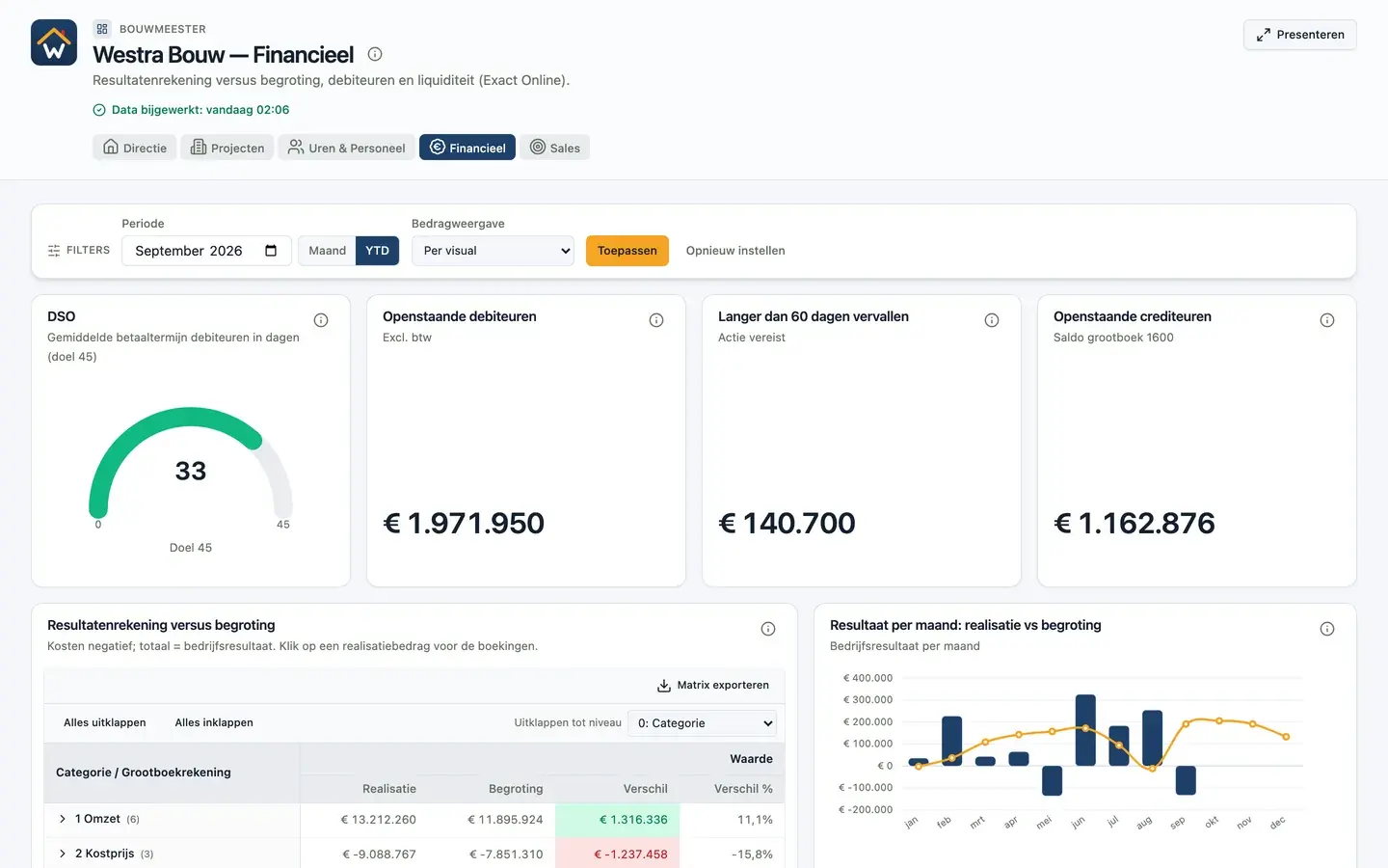
Finance dashboard example with DSO, receivables and profit and loss versus budget

Example 2 of 5

Finance dashboard

For the controller and leadership: the profit and loss statement against budget, liquidity and which customers pay late.

On this dashboard

  • DSO (days sales outstanding) against a 45-day target
  • Open receivables, payables and items more than 60 days overdue
  • Profit and loss versus budget; click an amount to see the journal entries
  • Monthly result: actuals against budget
  • Receivables ageing per customer and open sales invoices

Why it works: The matrix drills from category to general ledger account down to the entry. Whoever spots a variance finds the cause without an export.

Sources: Accounting (Exact Online)

Open the live finance dashboard
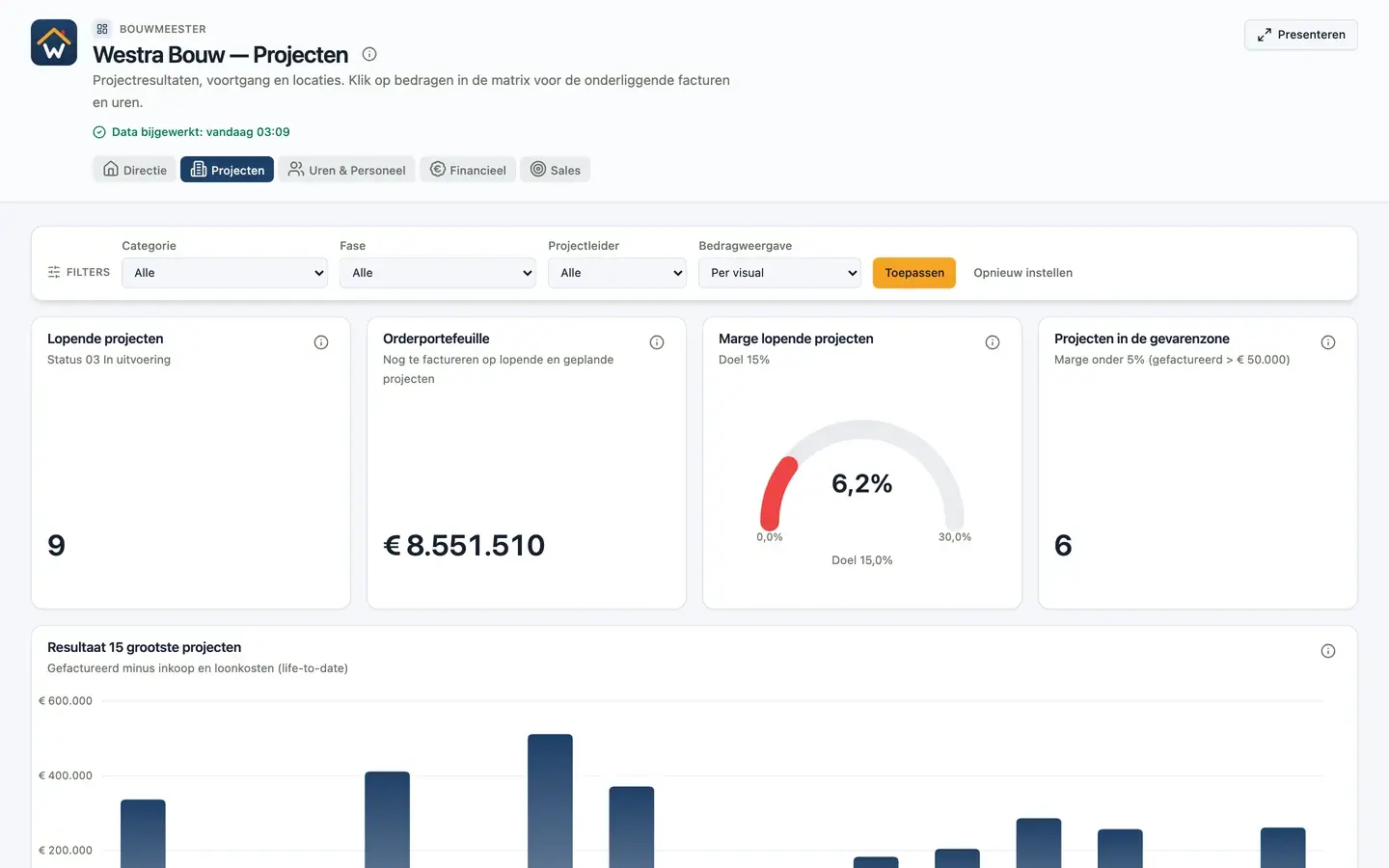
Project dashboard example with order book, project margin and result per project

Example 3 of 5

Project dashboard

For project managers and leadership: which projects make money, which leak margin and how much work is left in the order book.

On this dashboard

  • Running projects, order book and margin against a 15% target
  • Projects in the danger zone: margin below 5%
  • Result of the 15 largest projects
  • Project results per category, drilling through to invoices and hours
  • Progress versus margin and a map of project locations

Why it works: Filters for category, phase and project manager turn one dashboard into an overview per team. In presentation mode every category gets its own slide.

Sources: Project software (Exact Bouw) and accounting (Exact Online)

Open the live project dashboard
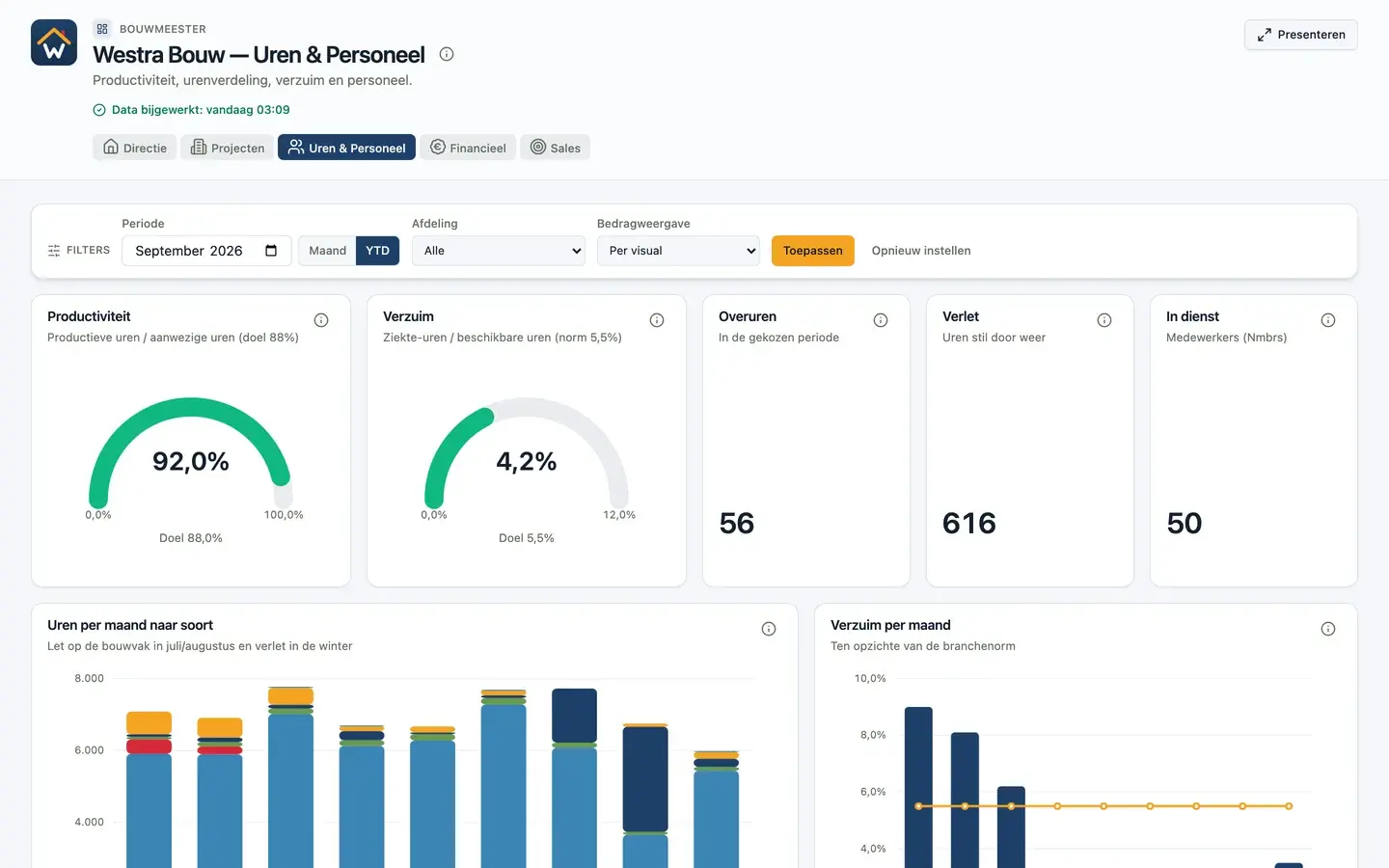
Hours dashboard example with productivity, absence and monthly hours by type

Example 4 of 5

Hours and staff dashboard

For operations and HR: how productive is the workforce, how many hours are lost to sickness and weather, and where do the hours go.

On this dashboard

  • Productivity against 88% and absence against the 5.5% industry norm
  • Overtime, weather downtime and headcount
  • Hours per month by type, including the summer holiday and winter downtime
  • Productive hours per department and employee
  • Open absence cases and the top 10 projects by hours

Why it works: Seasonal patterns are visible straight away, so a dip in July is not mistaken for a problem.

Sources: Time tracking (Exact Bouw) and payroll (Nmbrs)

Open the live hours and staff dashboard
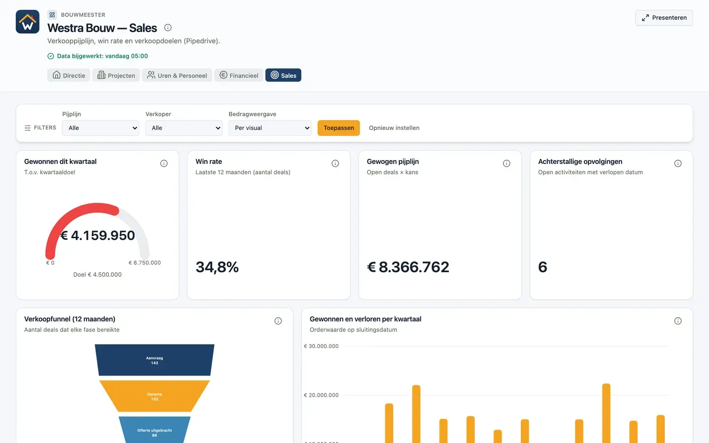
Sales dashboard example with quarterly target, win rate, weighted pipeline and sales funnel

Example 5 of 5

Sales dashboard

For the sales team: will the team hit the quarterly target, how healthy is the pipeline and which follow-ups are stuck.

On this dashboard

  • Revenue won this quarter against the quarterly target
  • 12-month win rate and weighted pipeline
  • Overdue follow-ups
  • Sales funnel and won versus lost per quarter
  • Open deals, loss reasons and where won orders came from

Why it works: Filters for pipeline and salesperson make the same dashboard useful for a team meeting and a one-to-one.

Sources: CRM (Pipedrive)

Open the live sales dashboard

Presentation mode

From dashboard to TV screen or board meeting in one click

Every dashboard and report has a presentation mode. Put it on a screen in the workshop or canteen, or present it in the monthly management meeting. You do not need a separate slide tool or export.

  • Ready-made presets for wall screens, meetings and spotlight
  • Auto-advance with its own timing per page, loop forever or stop at the end
  • Repeat a page per project, team or filter value, such as one slide per project category
  • Control it with a keyboard or presentation clicker; it pauses when someone interacts
  • Title bar with clock, progress and data freshness
  • Fits every page to the screen without scroll bars
Westra Bouw dashboard in presentation mode with title bar, clock, page counter and controls

Financial dashboard example: turn revenue into management KPIs

See how revenue, costs and staffing form a management report. This example uses entirely fictional data, in euros, from January through August 2026.

August 2026 KPIs

Gross margin

64.3%

(Revenue − direct costs) / revenue × 100

Days sales outstanding

17.0 days

Closing receivables / credit sales × 31 days

Operating margin

35.2%

(Revenue − direct costs − payroll − housing) / revenue × 100

Revenue per FTE

€14,353

Revenue / average FTE for the month

August: €122,000 revenue, €43,500 direct costs, €31,000 payroll and €4,500 housing. Operating profit is €43,000. Closing receivables are €67,000 and average staffing is 8.5 FTE.

DSO assumes all revenue is credit sales, excluding VAT, on the same basis as receivables. This is a simplified reporting example; your chart of accounts and KPI definitions may differ.

Financial dashboard example: turn revenue into management KPIs
MonthRevenueOperating profitClosing receivables
2026-01€85,000€20,500€48,000
2026-02€92,000€24,500€52,000
2026-03€98,000€28,500€55,000
2026-04€105,000€33,000€58,000
2026-05€110,000€35,500€61,000
2026-06€115,000€39,000€63,000
2026-07€118,000€41,000€65,000
2026-08€122,000€43,000€67,000
Download financial sample data (CSV)

Build your report in Power BI or Excel

  1. Power BI Desktop: choose Get Data → Text/CSV. Excel: choose Data → From Text/CSV.
  2. Use UTF-8, a comma delimiter and a decimal point. Set numeric types using English (United States) locale; keep month as text.
  3. Open Transform Data → Add Column → Custom Column. Name it OperatingProfit and use [revenue] - [directCosts] - [payroll] - [housing]. Choose Close & Apply (Power BI) or Close & Load (Excel). Use month as the axis and revenue and OperatingProfit as values in a column chart.
  4. Select one month for the KPI cards and apply the formulas above. Across months, add revenue and costs; use only the closing balance for receivables and an appropriate average for FTE.

This CSV is a starter model of monthly totals, not a full ledger or a ready-made Power BI file. For automated reporting, connect your source through DigiData and configure field mappings, relationships and calculations for your accounts.
Frequently asked questions

Frequently asked questions about dashboard examples

Please call: +31 6 15534337

What makes a good dashboard example?

A good dashboard answers a few recurring questions for one audience. Every KPI has a comparison with last year, a target or a norm, so you can see at once whether action is needed. Details sit one click away instead of on the main screen.

Are the figures in these examples real?

No. Westra Bouw is a fictional construction company. The data is generated automatically and refreshed every six hours, so the demo always looks current. The dashboards, filters and drilldowns are exactly what DigiData customers use.

Can I get a dashboard like this for my own company?

Yes. Once your sources are connected, such as Exact Online, Twinfield, Exact Bouw or Pipedrive, the DigiData AI agent can build a similar dashboard. We first agree on definitions such as revenue, margin or productivity so the figures reconcile with your books.

Which KPIs belong on a finance dashboard?

Start with revenue and result against budget, gross margin, days sales outstanding (DSO), overdue receivables and open payables. For formulas and thresholds, also read the article with 12 KPI examples for small businesses.

Can I download a dashboard example?

The live dashboards are read-only. To start in Power BI or Excel yourself, download the fictional financial sample data as a CSV at the bottom of this page.

14-day free trial · no setup fee

A dashboard like this, with your own figures?

We connect one source and show your own data in a 20-minute demo.